My DIY

Wallpaper Dreams

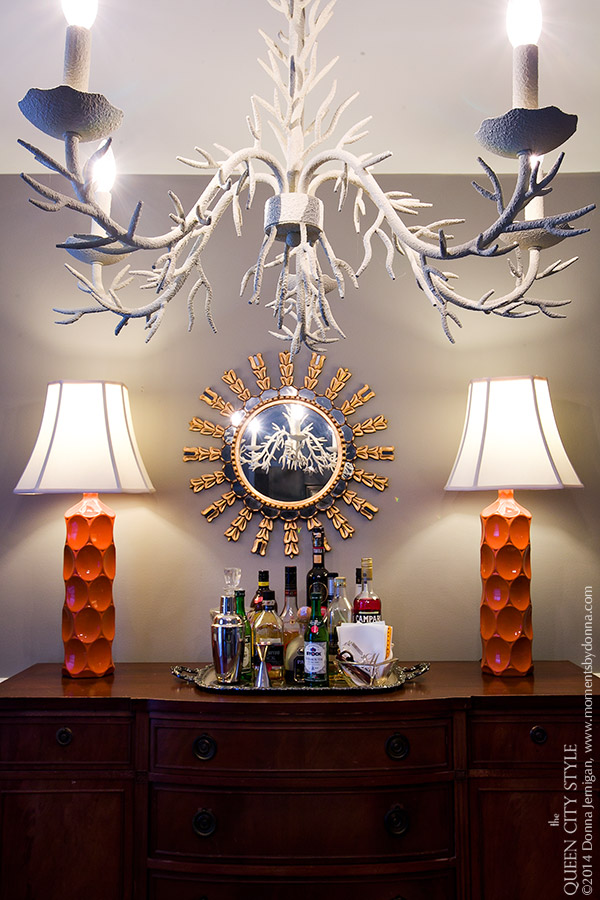
This past Sunday was simply way too hot to do anything outside, so I got on one of my at least bi-monthly decorating overhauls.  This doesn't mean move a few accessories on the bookshelf. This means move the biggest pieces of furniture into the room furthest away, and create an entirely new room.  I posted one picture of the foyer on Instagram.  I moved this sideboard/chest of drawers all by myself, down and up the other side of the sunken living room, and across almost the entire length of house.  Pure happiness (now working my way toward shredded biceps)!  

At any rate, I'm constantly dreaming of wallpapering many rooms of the house, but that is not so much a way to decorate on the cheap, so for the meanwhile, I happily use lots of bright colorful paint as a way to create a completely unique look.  I will never stop dreaming, however, so below are a few more affordable papers I am currently loving.  Click on the blog post title if you are unable to see the below images in your reader...

House Reveal: Hall/Boys' Bathroom

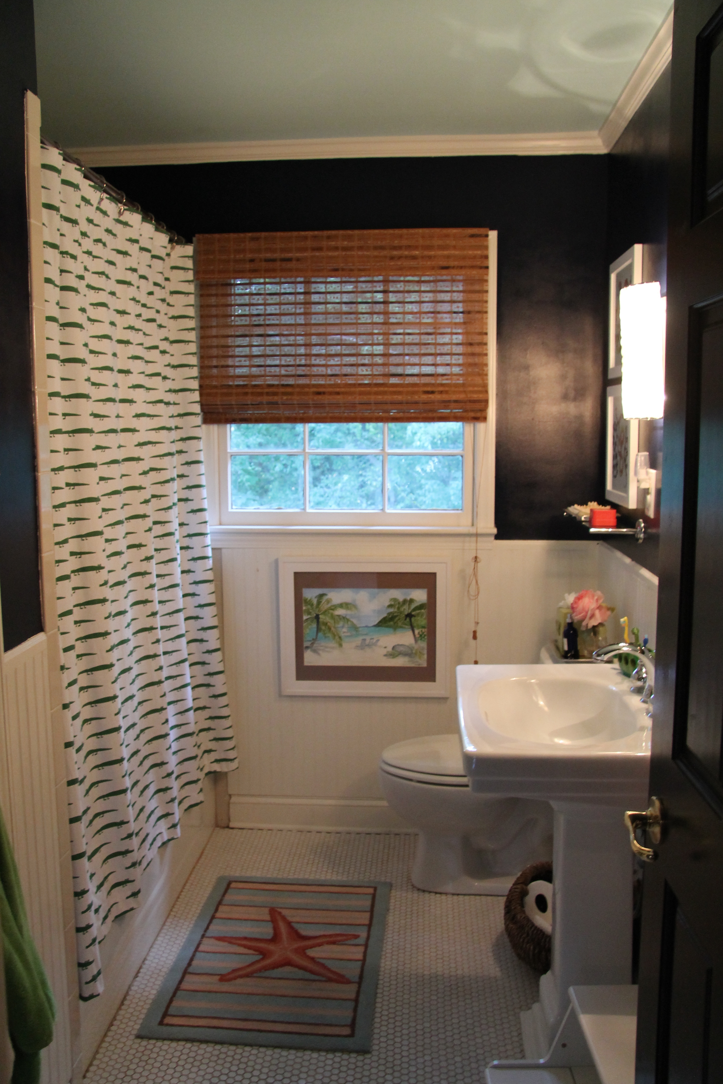
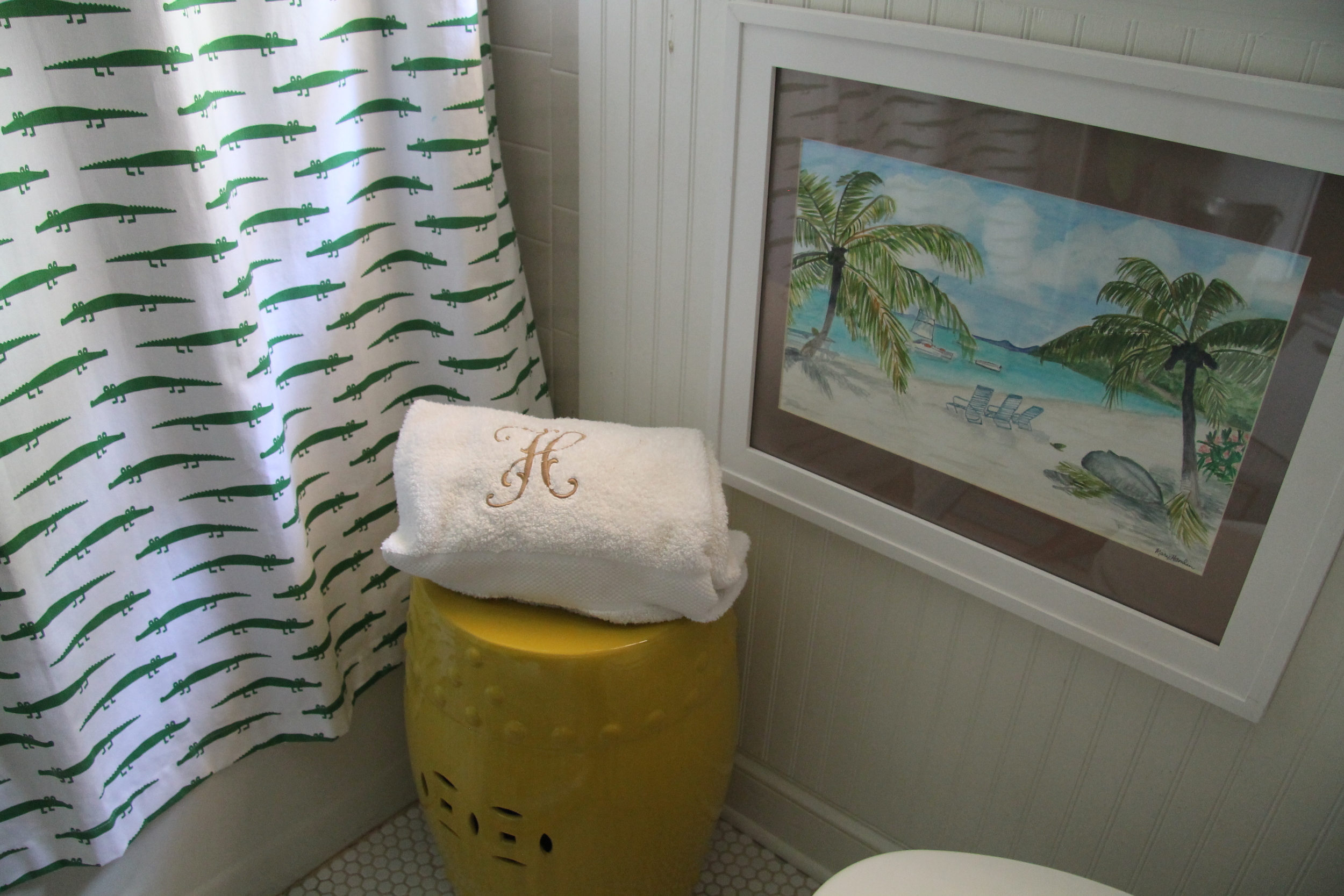
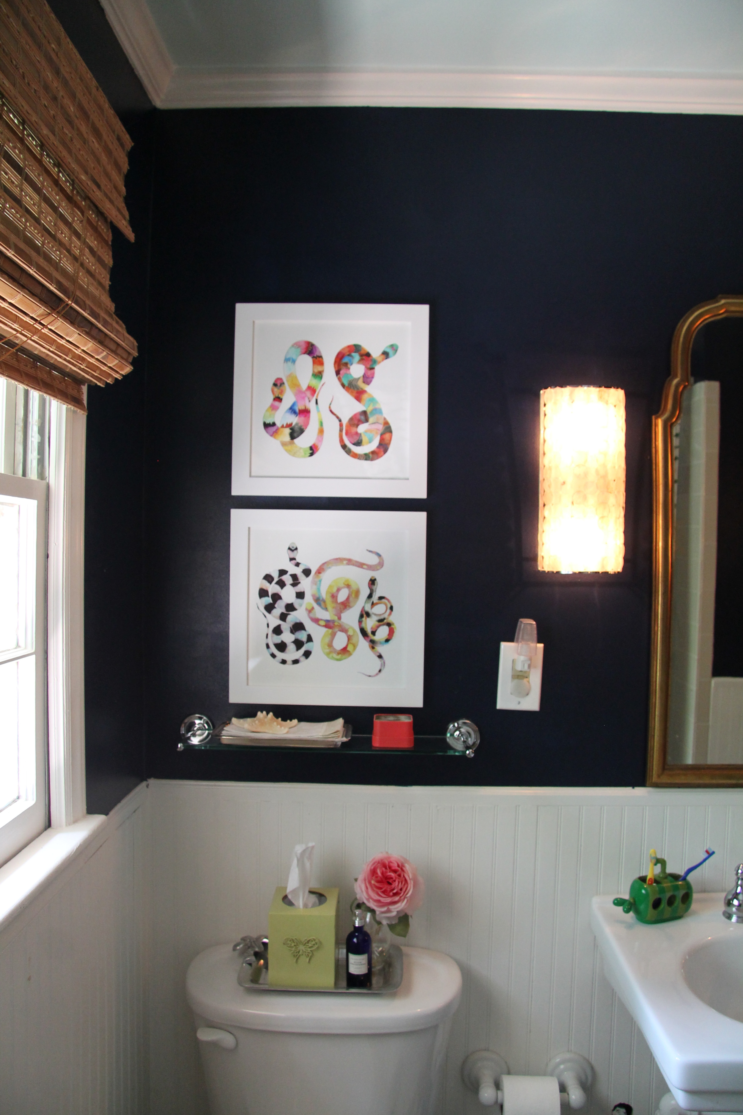
Last month I shared my inspiration board for a new hall bath design.  Because this bathroom is shared by our two boys, ages six and three, as well as any guests, I wanted to come up with a design that would be fun for the boys but still chic for everyone else. After a trip to my favorite interior design store in the entire U S of A, Furbish Studio, in Raleigh, NC, I was able to add some whimsical pops of color to the room which was originally planned to be Kelly green, white and navy, designed around the Serena & Lilly alligator shower curtain.  

The bathmat was a gift my mom graciously picked up in Georgetown, SC, and my talented, sweet mother-in-law painted the watercolor.  Reminiscent of our family sailing trip around the BVI, the picture depicts your back toward the Soggy Dollar Bar, birthplace of the deliciously refreshing Painkiller, looking out onto White Bay, Jost Van Dyke.  It's safe to say I'm happiest near blue green waters.

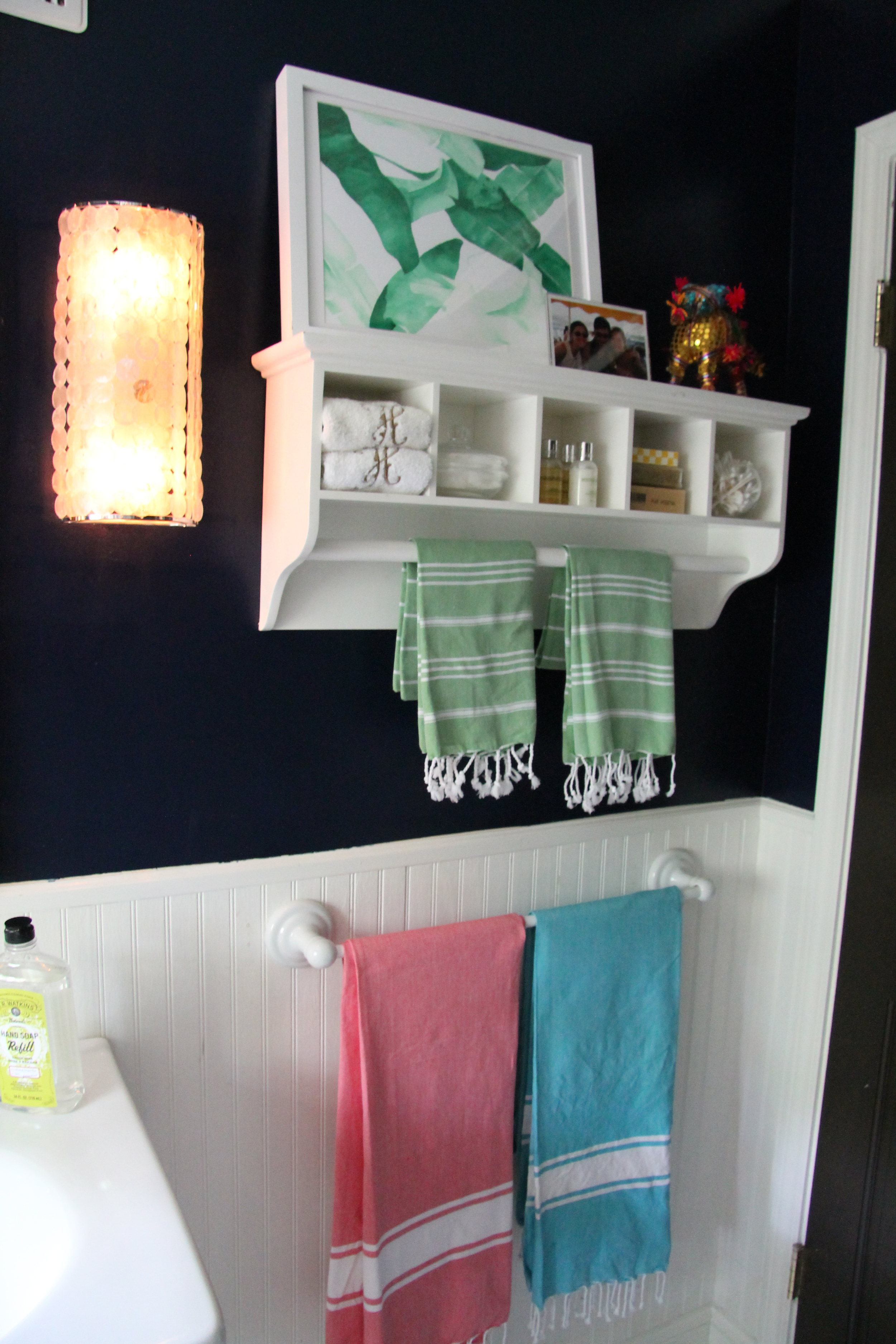
The capiz shell sconces I eagerly snagged from West Elm right after we moved into to the house. These are the closest I'm able to find, and I'm very excited to have just purchased the pendant shade version recently for our foyer.

The orange bikini girl is a print made by a long time family friend.  I wish she still produced them!

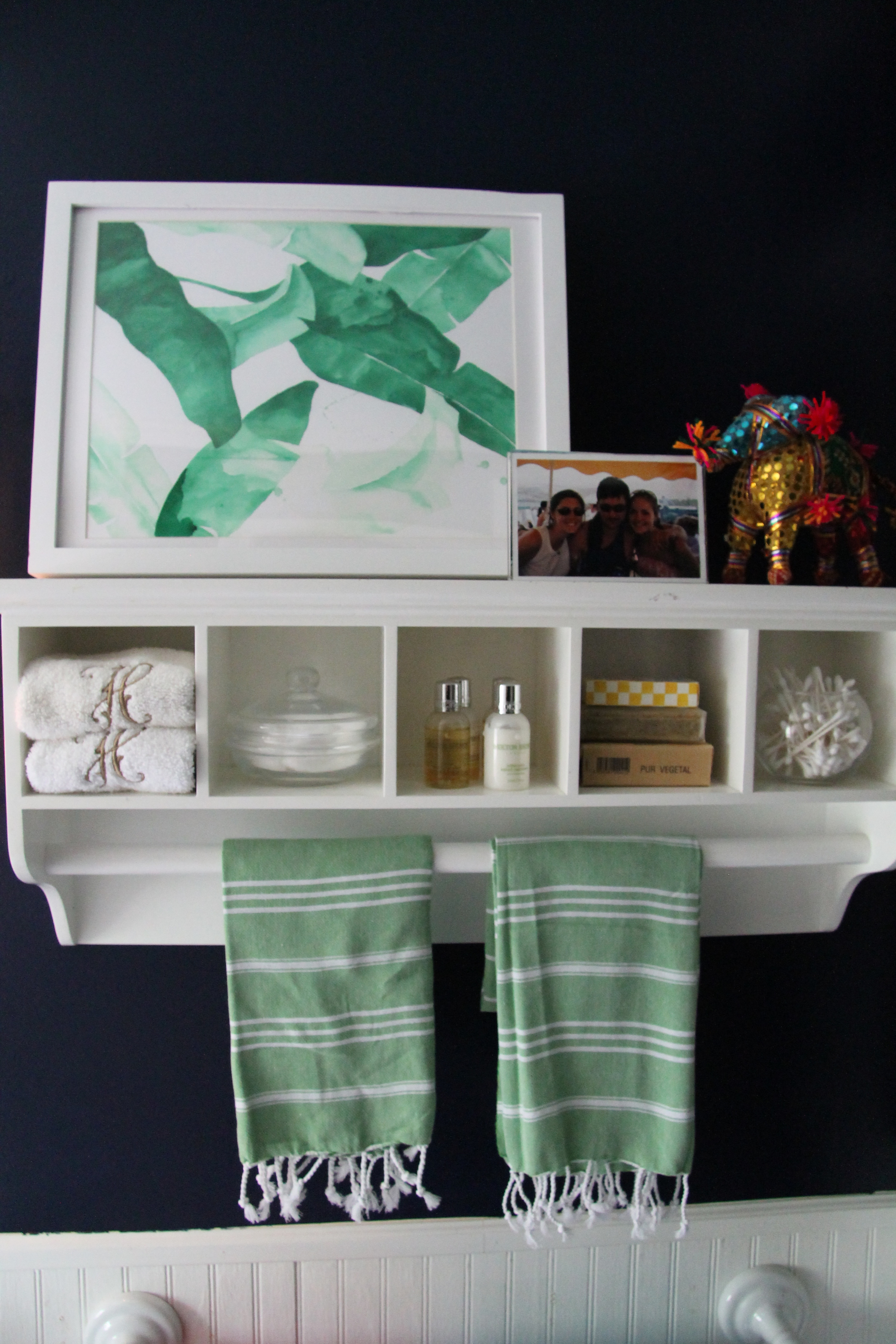
My girl, Jessica, painted the Beverly palm print, and the Turkish towels and cute little donkey are from Furbish Studio.  Those are my two friends (one real life friend anyway) in the picture taken at a very long ago Carolina Cup!  Good memories, they never fade, but I'm so glad we have this one documented on paper...

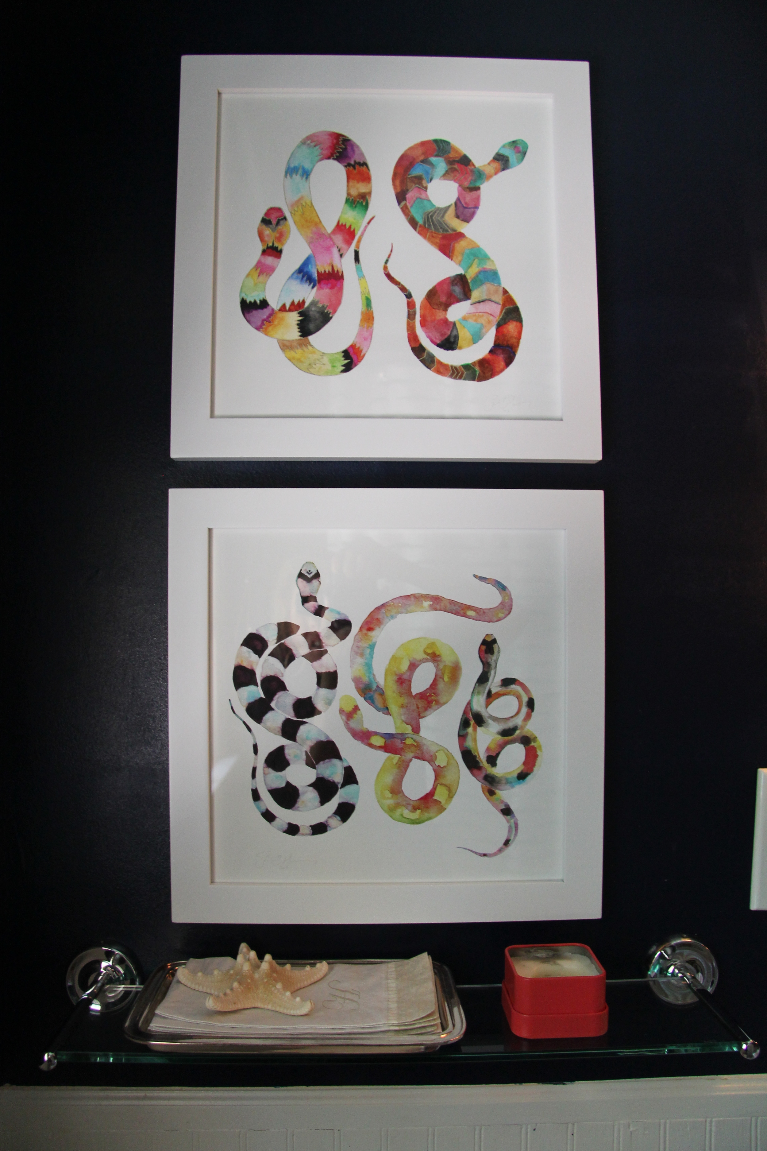
And last but certainly not least, those crazy fantastic crazy snake prints, also from Furbish Studio.  My new favorite is this donkey.

And there you have it, viola!  Until the next itch to change comes a creepin'...

My House Project In Print!

It has been such a fun opportunity to partner with Fort Mill Magazine, a gem of a publication, which happens to be about a little town just south of the border that is a big part of my heritage. When the owner said they were interested in featuring my completed Living Room and Dining Room Redesign in the Texture section of their newly revamped publication, I really couldn't believe it.  I still can't!  Go figure, yesterday when I was vacuuming in the dining room, I realized the foyer needed to be painted... a fantastically fabulous bright happy shade of plum!  My husband already found the paint cans in the corner of the room. Can you imagine his tone of surprise when he asked what room I am painting purple?! In all actuality, he handled it quite well. After all, we have the rest of our lives to live in beige, don't we?  You can check out the entire story here.  What do you think?  Is my love affair with bright over the top or just right?

Boys' Bathroom Project Update

Last week I shared the start of my boys' bathroom redesign project.  I wanted something young and fun, relevant for two little boys but also hip enough for any guests, since this is our hall bath. The little marching alligators shower curtain from Serena & Lily was my starting point.  I finally got to experience in the flesh my interior design retail obsession du jour, Furbish Studio, when I visited their Raleigh store last weekend.  I've been eyeing these colorful snake prints for some time now via their website, and seeing them in person, well... had to have 'em!  I think they are quite genius for bridging the gap between relevant and cool for little boys and totally hip for guests.  Here's a layout of the current bathroom.  Just click on the plus signs to shop any item straight from this post!  Happy Weekend!


Little Boy Bathroom Design

I've been wanting to redo the hall bathroom since about six months after the last time I changed it.  I was in love with the color on the walls of our guest room before I became pregnant with Precious Peanut #2.  We waited to find out the gender until after Worth was born, and I rolled the dice keeping the wall color in the event Worth was a girl.  Alas, we were blessed with baby boy #2.  After he was born, I immediately got to painting both the baby's room to a bright and lively (smurf!) blue and the hall bath to the sweet Benjamin Moore Queen Anne Pink I loved so much.  Trying to work with only the resources I already had, I couldn't ever quite get the bathroom just like I liked it, so I've been living with it all this time. Please tell me I'm not the only one who lives with something they don't like for a long time, because they are cursed with the darned DIY disease!  

Boys Bathroom

At any rate, the above collage is what I came up with for the boys' hall bath room.  The bottom half of the room is white bead board, and the navy blue represents the top half walls.  The aquamarine is the color of the ceiling.  I think this Serena and Lily Alligator shower curtain is so cute, thanks to the tip of Julia!  My boys LOVE the beach, as do I, so I thought this was a friendly boy bathroom, but still chic enough for our guests. Instead of the ocean pic, I'll likely blow up a picture of the boys on the beach real giant.  While I wait for the bathmat and shower curtain to arrives, this is the current state of the bathroom.

What do you think? Can you tell I have beach on the brain?!!  Shop the look here: 


Vignettes In My Living Room + Dining Room


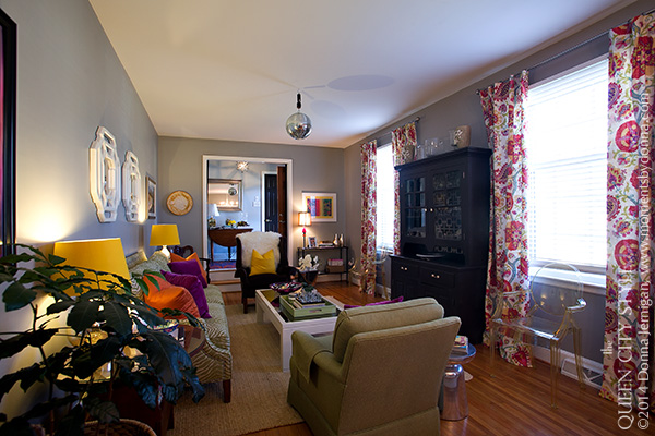
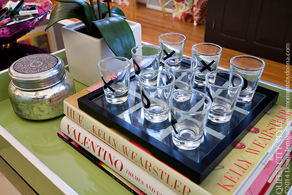
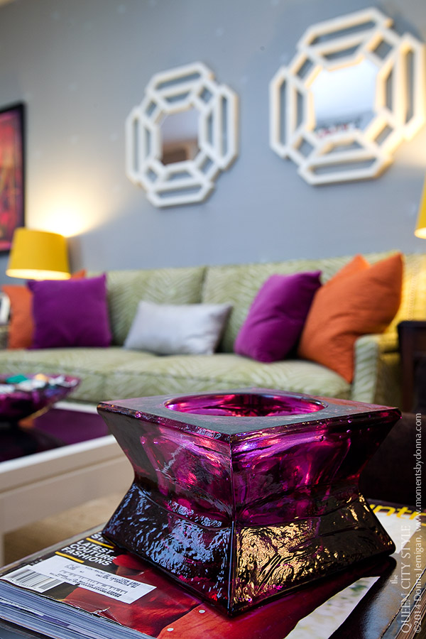
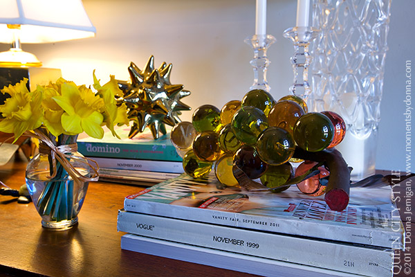
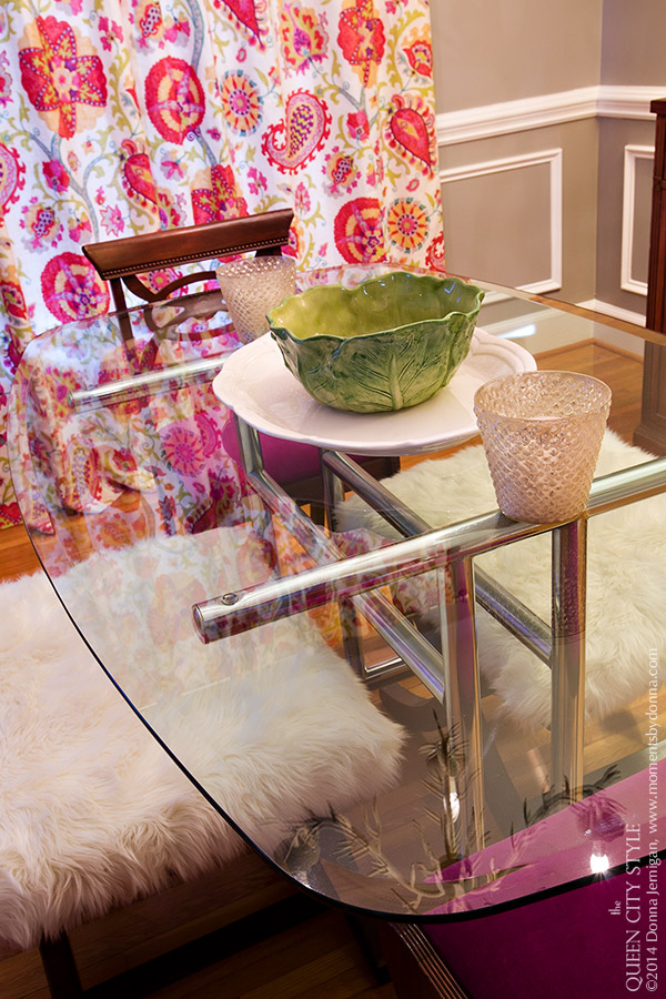
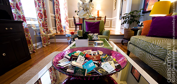
Last week I excitedly shared my Living Room and Dining Room redesign with you, and so today I wanted to follow up with some photos of a few vignettes around the room.  Thanks so much for all of the sweet comments and complements.  Fashion and style are all such a personal matter of opinion and taste, and so regardless of you what your own personal style is, thank you for allowing me to share my latest design project with you!  Interior decorating is my second favorite form of channeling creative frustration, behind fashion, of course.  I am no trained expert, but one thing I do know how to do is have fun.  I think these two rooms are a reflection on my passion for having as much fun as possible with whatever it is I am doing in this life.  Hence the disco ball!  I LOVE to accessorize, and they do say it's all in the details, no?  With my attraction to so may different styles, it will be an accomplishment if this room makes it three years in its current design state!  Cheers y'all!

Simplicity

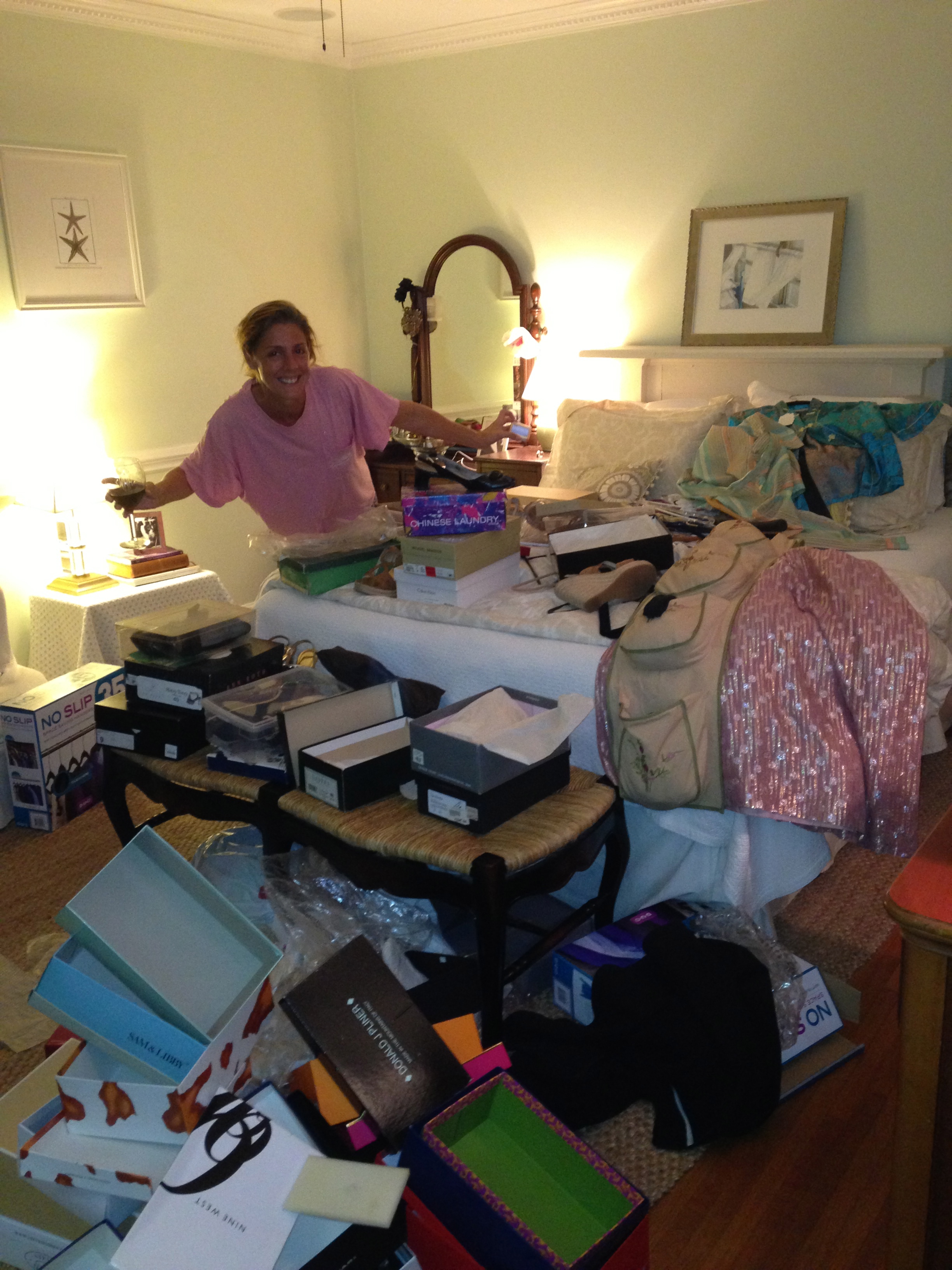
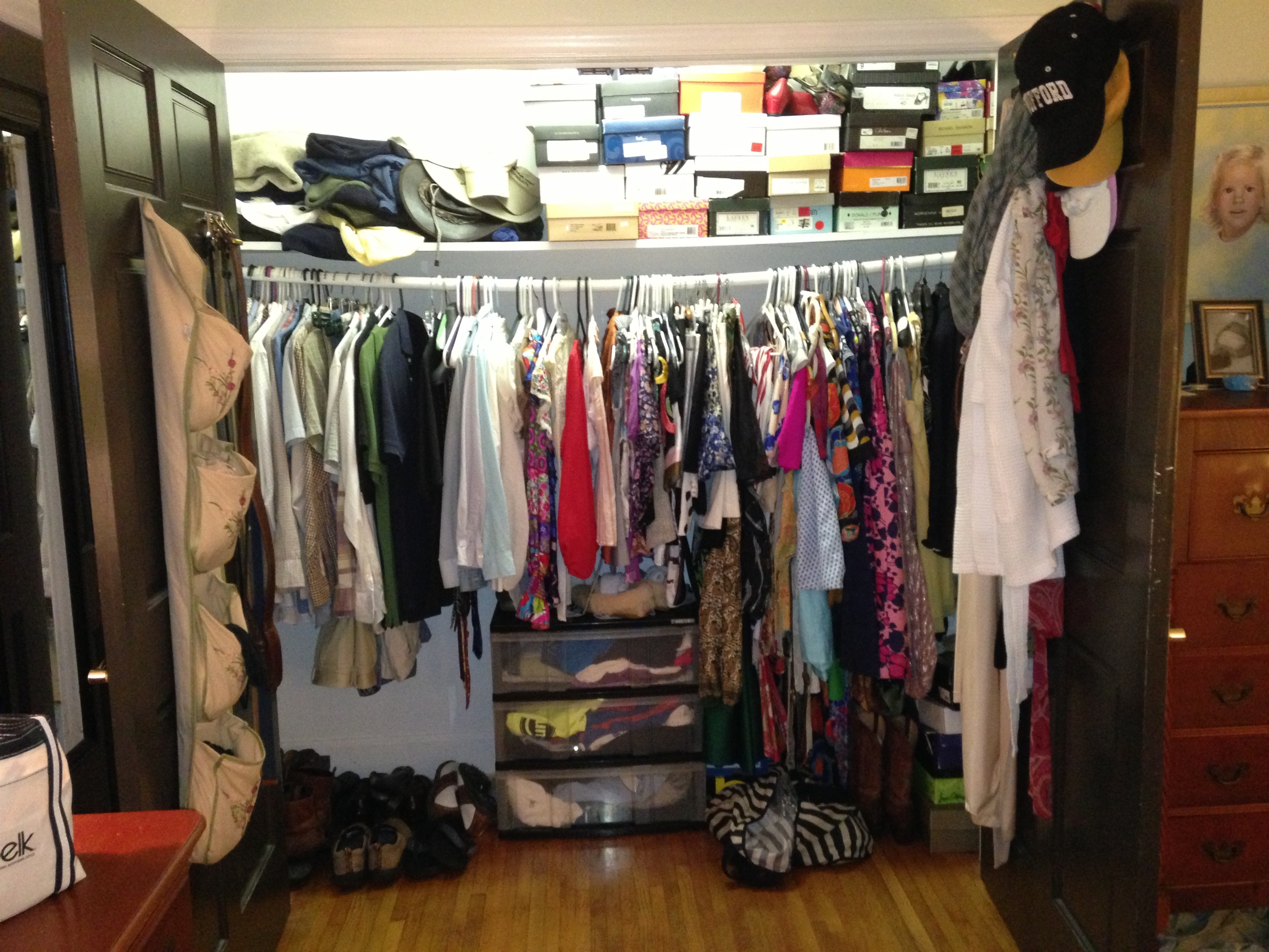
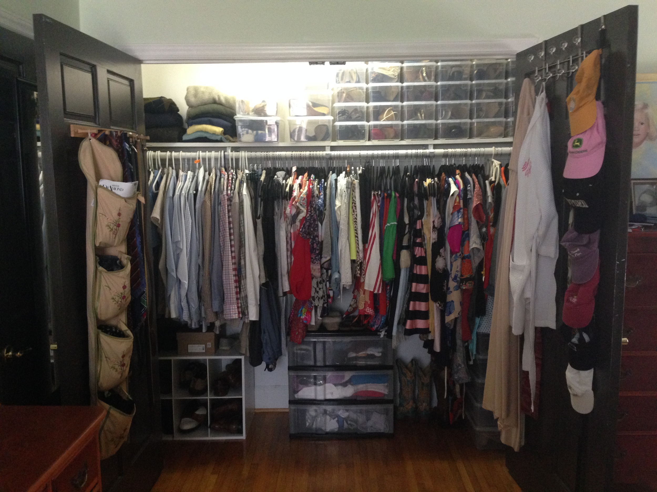
Just because I love fashion doesn't mean I am orderly about it.  Overall, I think I am an organized person, but the right brain side of me always seems to creep into the picture.  I guess that's what you called organized chaos.  In this month's Charlotte Parent Magazine,  I shared Four (unexpected) Ways To Treat Yourself This Mother's Day.  I wanted to take a moment to highlight one of them.  My husband and Precious Peanut #1 have been at ski school since Thursday, and while being with Precious Peanut #2 for four days with zero break is utterly exhausting (holla if you hear me), I always seem to get so much more done around the house when there's only one.  I'm going to take a quick moment just to say that after taking my creative frustration out on our yard and patio, I think it is now borderline Charleston Gardens material. My closets have made some notable progress as well, thanks to the mad organization skills of Simplicity Professional Organizers.

Here is the BEFORE...

My Closet Before Simplicity Entered My Life

My Closet Before Simplicity Entered My Life

And now, here is the DURING, then the BEFORE again and the AFTER...

Here's the thing.  Could I do this on my own?  Yes.  Do I have the time, energy or interest?  The time, no, but you make time for something that is important.  Energy or interest?  H E double hockey sticks to the NO.  With all the hats I wear, just taking the time to figure out where to start with a project like this was daunting.  Simplicity came in, and BOOM.  They told me exactly what I needed to do and what tools were needed to fix the problem. Some of the biggest changes you will see are the coordinating hangers, the amazing clear shoe boxes, my husband's new shoe rack, the band for my baseball caps and the biggest thing... Jon was given the task of literally raising the bar.  Did you see how bad that clothing bar was bowing?!  Bravo!

If I never get that extra bedroom turned into a closet all for myself in this house, I'm gonna make the best out of what I have.  I still want to paint the interior and change the lighting and perhaps throw down a little rug for color.  Having professionals like Simplicity come into your home is an indulgence, but it is worth every last penny.  I know for a fact ain't no mama out there going to argue with me that this one is better than........ a pedicure!  Get the 411 on Simplicity here.

Hutch to Bar Renovation

Okay, so I'm pretty sure the below picture is how this whole hutch to bar renovation project came over me.  It's been a long time since I first got the idea in my head, but I think the below inspiration came to me via way of Cottage Living magazine (RIP).  I remember reading the story, and the owner stated that the piece was an old family heirloom.  She gave the outer coat a new shine and painted the inside this pretty shade of blue, and voila!  It was re purposed for a bar.

My inspiration

Once Jon and I purchased a home, I quickly became waaaay more than ever into the whole antiquing thing.  I couldn't keep myself away from flea markets, antique stores and the like, and so shortly thereafter I found the below piece at Sleepy Poet Antique Mall on South Boulevard.  This is the best place to shop multiple antique retailers all under one roof.  I immediately felt that it had potential.  The thing I liked most were the glass window pane doors.  I won't tell you what I paid for it.  I cringe a little now thinking about it.  I did ask if the vendor could do better than the sticker price, and he did, so that was a bit of a win.  However, I still could have paid much less.  In hindsight, it was a good learning experience.  The only way to learn and grow is through practice!

My Hutch

So, my new hutch sat in our equally not so pretty and empty living room.  For years, it was the only piece of furniture in the room, aside of all my son's toys.  Then, the time finally came when I would rip the band aid and get a living room!  Eh hem... this does not mean go out and get, this means make.  I did purchase a few of the main items, but there is a lot of blood, sweat and tears in that room.  At any rate, you can see in the below picture where the make over began.  The piece was terribly ragged in appearance... All's she needed was a little face lift, if you will.  So, I began by taping off the window panes and filling in all the little holes and indentations with wood filler.  Fairly time consuming...

My hutch with a little ace bandage and pimple healer.

Chippy all over

The hutch is two pieces, a top and bottom, so it had to be dismantled.  The next step was to sand and paint.  I decided to go with a darker color.  I knew from the beginning I wanted to do some fun color or pattern on the inside of the glass doors, and I wanted it to really pop.  So, I went with the color we have used on all of the doors in our house, Bronze Tone.  I had some left over, so yay, no money spent on paint!  I should add that at this point I really did not want to spend another dime on this hutch.  I LOVE all things pink, so I decided on this bright shade of coral for the inside of the drawers and lower cabinet.  I made it all the way up until this point before roping most wonderful man in the world into my project.

Jon getting involved is actually a VERY good thing.  The man can do anything, and he's kind of a perfectionist, so this means it will look even better.  All the hardware was showing its age, and he decided the hinges needed to go.

Dirty old hinges

So we head on over to our home away from home, Black Hawk Hardware, and went searching for new hinges. They didn't have a match. Wow... might be a first that they didn't have what we needed. Jon researched and found a group on line that would shine up our hinges like new for $8 a pop.  That's $64 in shiny new (old) hinges.  Thanks, but no thanks.  So, he kept on researching until he found a solution.  And...who knew that soaking your hardware in ketchup and scrubbing for 20 minutes with a Brillo pad would have your hinges looking so shiny and new?...

Holy Smokes!  Now, that there's a shiny hinge!

Might make you want to rethink offering ketchup at your next neighborhood cook out, but again, look at that shiny hinge!  Moving right along... the next step was to pick out new outer hardware for this really starting-to-look-handsome piece of furniture.  This is where I was prepared to spend a little bit of money.  I looked at all your traditional hardware stores and ended up going with these pretty natural bone and brass pulls and knobs from Anthropologie.

Pretty new hardware from Anthropologie

Next up was to tackle the back inside wall of the hutch.  This is where I was really hoping to have some fun.  I thought about covering it with wallpaper or even wrapping paper, painting a design or painting a stencil, which is ultimately the direction we went. My taste seems to be fairly ever-changing these days, but for now I'll call it "Boho Glam".  It's kind of like my dress.... a little bohemian, a good bit glam, timeless, not trendy.  I love the glamour and elegance of old Hollywood, and so after doing quite a bit of research on line, I found the perfect stencil at Royal Design Studio.  Appropriately enough, the stencil is named Hollywood Squares. I knew I wanted to use a metallic paint, either silver or gold.  I found the below Martha Stewart Living paint over at Home Depot. It was offered in a plethora of metallic finishes, and I decided I was going gold!

Martha Stewart paint from Home Depot

Using a roller, we (or rather most wonderful man in the world) first painted the back of the hutch wall with our Bronze Tone.  We then taped down the stencil with painters tape and painted over it with the metallic  paint.  When the paint was dry, we peeled it up, and this is what we got...

A big ole crackly mess.

At this point, I was starting to be a little concerned my stencil might not work out as planned.  So I called Royal Design Studio, and as it turns out, this is a common issue with metallic paint.  They actually sell a special metallic paint for stencil work.  Not wanting to spend any more time or money, I decided to just reverse the stencil.  So, most wonderful man in the world was back at it with the paint and roller, this time painting the wall with the metallic and then the stencil on top in the Bronze Tone.  And, Hurray!... Beautimous!!

Hollywood Squares Stencil by Royal Design Studio

Yay!  Gorgeous back wall of my hutch!

Time to start putting this handsome devil back together!  That's me gettin' down in my jammies... With two small children, we were working on this late into the night many, many nights. Thank you again most wonderful man in the world for sticking with me through all my crazed projects! xo

Watch out!

 Almost there, and totally loving the way he is smiling back at me...

Top half all dolled up... and.... TAADAAAAAAA!!!  Super duper excited!!

What do you think??...      

Now I just need to get this baby stocked with all kinds of fun things to get the party started!  I'll bring you some pics of that in my next post.  Thanks for reading.  Hope you have an o so stylin' day!  Whitley

Baby/Guest Room Details, Accessories and More Part II

Hi there!  I'm back to share the final details for completing Baby Worth's new room.  I already had a fabulous red and white print fabric which I purchased at Robyn's Fabrics.  I LOVE this print.  I think it lends a touch of whimsy to the room with the trees, little deer and birds on it that appear to be passing through a forest.  Fun for a child's room but also pretty hip for adults.  I first used the fabric to make a pillow cover for the bed using a lumbar insert I already owned.  Then, I used the same fabric to make customized letters for the room.  Truth be told, I'm personally kinda burned out on the letter thing, but I thought it would be another easy and personalized way to tie things together.

I spent some time determining how I would affix the fabric to the wood letters.  I decided I wanted to apply padding to the letters to add some depth, so I used batting I had purchased for another project which I never got around to completing--or starting for that matter!  Yay... free material for this project anyway!  I tried doing this first using a staple gun, and while the batting stretched fine around the letters, the fabric did not.  Total mess.  So, then I traced the letters onto the batting and cut them out.  Then, I traced the letters onto the fabric and cut that out.  I followed the instructions conveniently located on the back of the batting to iron it to the fabric.  Who knew?!  First time I've used batting, and it worked!  I then just glued the new cut batting and fabric to the letters.

I found a home for the letters right over the rocker.  I liked it but felt like the letters were kind of "floating" on the wall and needed some grounding, which you can see in the below picture.

So, I decided to glue add some black grosgrain ribbon around the edges of the letters.  The letters were probably only an inch deep at most, but again I didn't want to spend any money, so I ended up using some left over 2 1/4 inch ribbon I had for the bed skirt.  I wanted a nice edge, so I ended up attaching the finished edge of the ribbon to the edge of the letters then glued down the extra ribbon to the back of the letters.  It was pretty time consuming, and it definitely would have been easier using ribbon that was the proper width, but whatever... paid nothing, gained experience, super happy with the outcome...

Next, I already had both of the table lamps you see.  My mother-in-law gave me the cute little owl lamp as a Christmas gift last year.  Both lamps were purchased at Target.  So for the side tables, the white one in the above picture we purchased at Kid to Kid, also over at Park Rd. Shopping Center.  I think we paid $30 for it.  It was a brown, somewhat scuffed up nice piece of Pottery Barn Kids furniture I imagine would have run us at least $150 new.  So, we primed and painted it white.  Recently, I decided to swap it out for this little magazine stand I purchased one late, late night out of the women's restroom at Tautog's, a bar in downtown Virginia Beach.  Not my most thought out purchase, but I'm sure you can use your imagination as to how it made its way home with me.  I recently painted it this bright red for another room in the house, but I thought it would work well as a night stand in Worth's room.  It holds books and cd's.

Back to the white fabric. I had this little table with glass top stored in my attic, so I decided to pull it out for the baby room.  I had my fabulous seamstress make a table skirt and add black piping around the edge.

I also used some of my red and white fabric to jazz up the table top a bit.  I really like the way this looks.

It plays home to a few items given as gifts to baby Worth, including this precious little elephant from big brother Hank's classmates, which I believe was purchased at Cottage Chic over on East Blvd.

 And this pretty monogrammed velvet-lined keepsake container from Worth's Godmother.

Perhaps you've wondered, where is the changing table?  Well, it's hiding in the closet to allow for a more comfortable room.  We found it Craig's List, and it's in perfect condition.  The previous owners showed us their receipt for $600.  We paid $200.  I would have taken on another redo project and perhaps turned some other piece of furniture into a changing table, but most wonderful hubby and I both were pretty tired of the projects. I'd like to paint the inside of the closet a fun color and do a little better with my mess of off-season clothes on the top shelve, but no time for that right now... I've got so many projects!

 I'll spare your eyes of the mess, and close the doors.  Aaahhhh.......

I hope you have enjoyed this step by step tour of Baby Boo's room.  I think he's totally living in style! Do you?  I hope everyone has a wonderful, safe and Happy Thanksgiving!!  Whitley

Baby/Guest Room Details, Accessories and More

Hey there!  So, here is a break down on how all the details came together in pulling together Worth's room.  My friend Anna let me borrow a crib skirt and black and white check crib sheet she had from her son's nursery.  It was perfect compliment for my black and white chair, and so I had my first accent pieces free-of-charge! 

Since I knew I was keeping the bed in the room, and it did not have a bed skirt already, I decided now was a good time to get one.  I would have purchased one sooner, but the drop from the top of the box spring to the floor is about 28 inches, so it would have to be custom-made.  I sew most of my pillows and draperies myself, but I haven't taken my hand yet at a bed skirt, so I farmed out this one.  If anyone needs a referral around the Queen City for high quality work at a most economical price, please let me know!  Of course, I made a trip down the road to the one and only Mary Jo's for some inexpensive yet quality white material.  I decided to coordinate the bed skirt to the crib skirt by adding black grosgrain ribbon trim.  I had the ribbon mitered on with a long stitch, so it could easily be removed, and I would still have my white bed skirt for the bed in another room.

This gave me my first project.  I made the pillow with ribbon trim and once we had baby boy and a name, I took it over to L&M Monogramming on East Blvd. for a little personalizing.

Next, I made these frames as a way to tie together all the colors in the room. I found a tutorial on line by super creative Eddie Ross for making this easy project using alternating colors of satin ribbon. Obviously, I knew which colors I would use, but I needed to decide on the layering pattern for the ribbon.  I purchased all materials from Michael's over at Park Road Shopping Center.  Truth be told, I moved to this location of town if for no other reason than that shopping center.  I mean, there is nothing you can't do there! I love all things unique, and these frames customize the decor of the room at total a bargain price.

Layering the ribbon

Frames up on queen anne pink walls

Frames complete with zoomed-in shots of happy baby boy

Thanks so much for reading!  I'll show you the remaining details in my next post.

For the love of great style.... and have a wonderful weekend!  Whitley

Guest Room to Baby/Guest Room Transformation, Part II

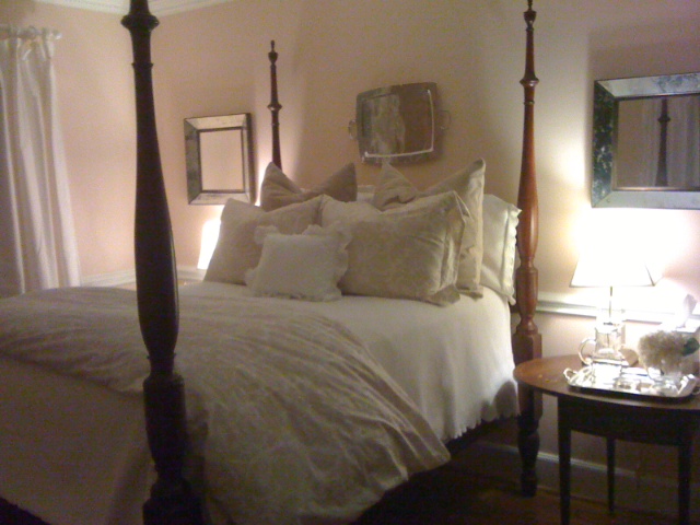
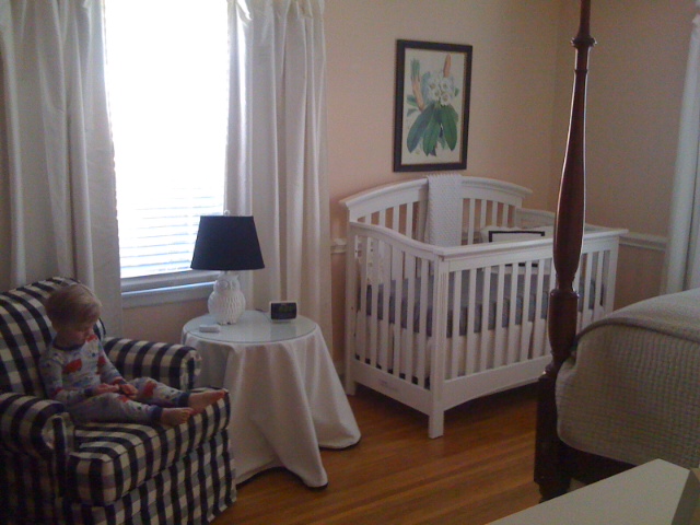
Hi there!  With both boys we decided to not find out the gender prior to delivery.  As I mentioned in the last post, I just completed the guest room when I shortly thereafter learned I was pregnant with baby #2.  I was so proud of the way that room looked.  I found the perfect peach/pink blend for the walls, queen anne pink by Benjamin Moore.  I knew that we would wait again to find out the gender of baby #2, so I decided I would just leave the color on the walls.  The crib we used for our first son was a hand-me-down on its fourth use, and he destroyed it, so we couldn't even donate it to Goodwill.  I was basically starting from scratch.  I did, however, have this wonderful black and white check rocker passed down from my cousin that would become the grounding piece for the room...Voila!  If it were a girl, it would be pink and black and white... my little Chanel room!!  So, I put the black and white check rocker in the room, moved the furniture for baby into the room, and perfection.  I absolutely loved it.

Room fit for a little princess.

Hank ready for his new baby sister.

Everyone seemed to think we were having a girl for whatever reason, and so I think I too was convinced of it.  If baby was a boy, however, I had no game plan.  

As a side note, I need to mention that our house is three bedroom, so this meant we basically would be losing our guest room.  Once you have children, I feel like there is a direct correlation to the number of overnight guests you host in your home.  I did, however, want to at least be able to offer a bed for my in-laws or any other surprise visitors that needed a comfortable place to rest their head.   

Fast forward to delivery day... Out popped baby #2, and in this order my husband exclaimed "It's a Boy!" and "I'm Not Painting!" And thus for four months, our sweet baby William Hollingsworth "Worth" slept soundly in his soothing pink room.  It was back to the drawing board on a new baby room.  I knew I wanted fun, punchy bright colors. I was still working around the black and white check rocker. I have always admired the way the hue of turquoise and red complemented each other, and I felt like they would do well with the black and white.  So, Voila again, my new color palette!  I hopped over to my home away from home for paint and everything else fabulous, Black Hawk Hardware, to make my paint selection.  Then magic happened.  One week this summer I took the boys to visit their Grandparents and that sweet most wonderful man in the world painted the room!!  Below is the picture and caption he sent to me...

Smurf Blue!

Whoa!  That is some SERIOUS Smurf Blue.  I was nervous to see it in person, but then when I saw it in natural daylight, I was completely happy with the was it looked.  As you can see in the above picture, I had already picked out some accent fabric in red and white.  After my dear friend Anna purchased a matching red quilt and pillow shams for her two boys from Target, I realized it would bit a nice fit for this room.  So, I trotted myself on over to Midtown Target, and purchased a set for baby Worth.  Perfect!  Below are some shots of the final outcome.  I love it.  As a side note, I read somewhere that black and red and white are the first color a baby is able to see, so I thought this is double winner :)  I wonder what baby Worth thinks?

A room fit for a King!

I love the sweet little table by the door.

Fabric covered letters to match lumbar pillow on bed.

Painted night stand to hold books, cd's and a couple favorite pics.

Every southern gentleman's room needs a touch of monogram.

Homemade ribbon frames for pics of  baby boo.

Sweet baby Worth

I hope you enjoyed this post. Next time I will share with you a little bit more about the accessories, fabrics, etc and how they all came together to create the final look.

For the love of living in style, Whitley